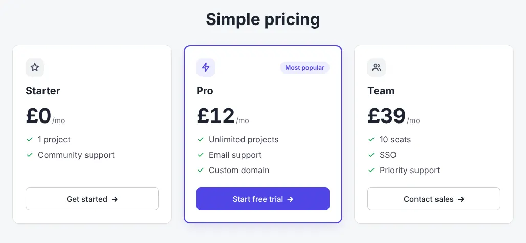
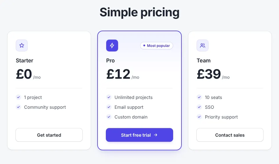
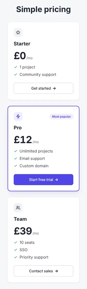
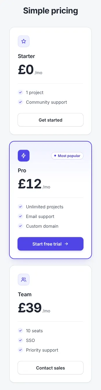
What the better-ui skill does
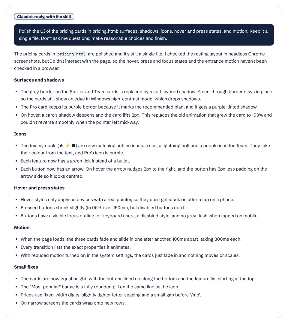
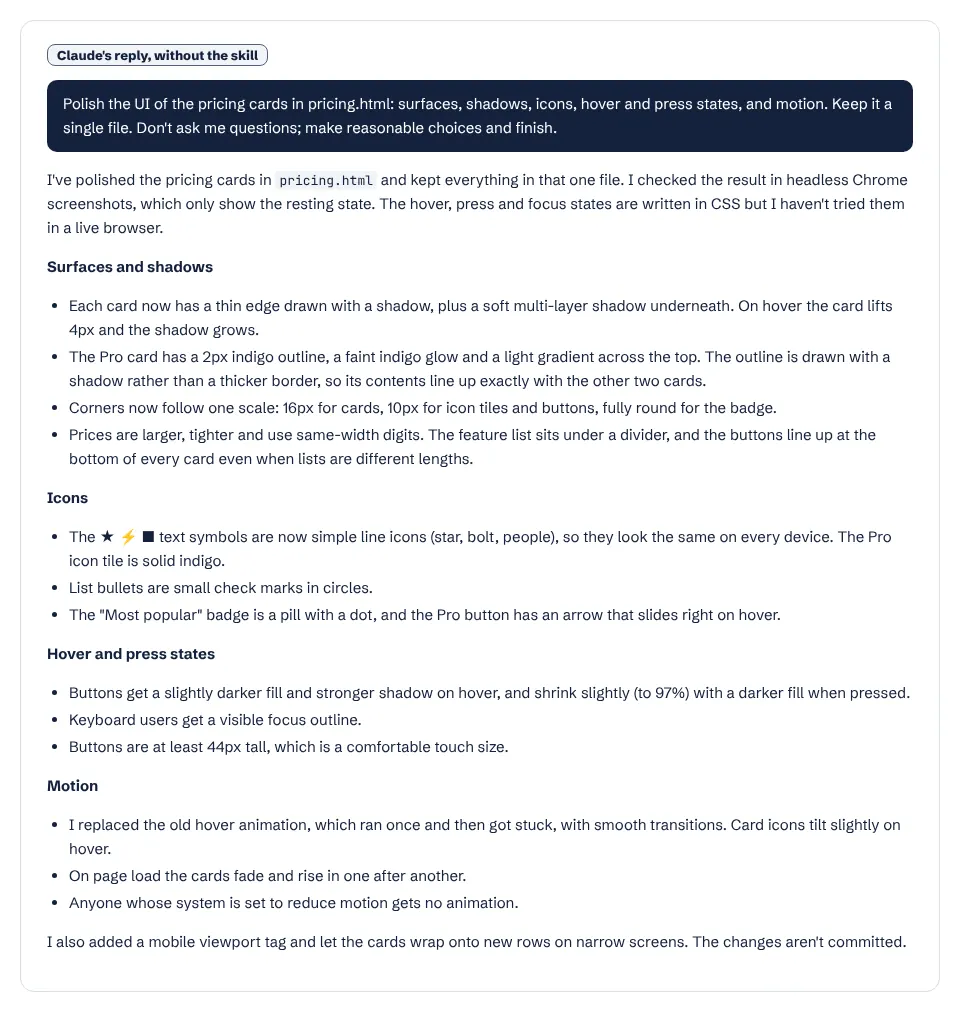
The skill applies once the interaction already works; a polish fix never outranks a broken interaction. Its values are exact, not ranges, except optical nudges, which are judged by eye. It keeps the project's own component library and tokens, and treats a consistent house style (for example, no shadows) as a preference, not a problem.
Surfaces. Outer radius equals inner radius plus padding. Shadows show elevation and borders show structure. A transparent border stays under a shadow so Windows high-contrast mode still draws an edge. Content images get a faint 1px black or white outline.
Optical alignment. A button gets 2px less padding on its icon side, and odd glyphs are fixed in the SVG.
Motion. Interactive states use transitions, not keyframes, so they can reverse mid-way. Pressed buttons scale to 0.96 over 150ms, and disabled ones never scale. Frequent interactions respond in 150ms or less. One-time entrances are staggered 100ms apart. Exits are shorter than entrances. Movement runs only when the user has not asked for reduced motion; otherwise it becomes a fade.
Recipes live in separate files: animations, enter and exit, icon transitions, icons, performance and surfaces.
Related skills
better-ui hands typography, accessibility, layout and colour to its companion skills (better-typography, better-accessibility, better-layout and better-colors), all in the jakubkrehel/skills repository. See more design skills.